According to recent rumors, "Asus is helping Apple build a Tablet PC." This comes only a few weeks after a rumor suggesting the return of the Newton handheld computer.
I strongly believe that (a) a new device is coming indeed, and (b) it will sport a MultiTouch interface.
But is it going to be an extended iPod touch/iPhone, or will it be a modified Mac? I think both are possible. Here's what I think about these two (not mutually exclusive) scenarios.
Mac touch
Tablet PCs have failed only because they were horrendously badly executed, and were saddled with ridiculous ideas. No usable keyboard? Why the hell would anyone want to interact with a computer via handwriting? Isn't typing demonstrably faster? Hello?
That doesn't mean, however, that a tablet PC is inherently a bad idea. On the contrary: at worst, eliminating a physical keyboard could easily save space and cost, ushering in a new class of unexpensive, miniaturized PCs. At best, a new set of thoughful metaphors could emerge, with several advantages over traditional input mechanisms.
The iPhone has shown us all that Apple gets it. The iPhone interface features direct manipulation metaphors that arguably beat everything else out there, including the mouse and the trackball. It can also simulate a keyboard, though the lack of physical feedback is a disadvantage. (Apple may be working on a solution there: I sure hope they are.)
How difficult would it be for Apple to modify Mac OS X in order to accommodate a MultiTouch user interface, complete with a usable onscreen keyboard? A stylus would probably be included for precision work, but most tasks could be achieved using your fingers. Just imagine your daily work on a Mac, and imagine using your fingers instead of the mouse: I'm hard-pressed to find anything that would no longer be doable. (Things like right-clicking would need clever substitutes, though.)
It can be argued whether or not "direct manipulation" of objects on the screen would be better than using a pointing device on a different surface. However, some new metaphors, borrowed from the iPhone and from trackpads of Apple's laptops, could definitely provide a superior experience. Think about two-finger scrolling, page-turning gestures, or the zooming "pinch": these certainly beat scroll arrows or "next page" buttons. And yet further multi-finger gestures could be born, something that no mouse could ever accommodate. (And besides, even single-finger gestures are much easier and more natural than their mouse equivalents: operating a mouse is not that easy; we've just all gotten used to it.)
Specs: If Apple believes the "Mac touch" to be a potentially superior device, one that would one day supplant both the desktop and the notebook form factors, shipping large and powerful configurations would make a lot of sense. If Apple only views the "touch" as a companion device, whose main selling point is its miniaturization, then obviously, we're only talking about smaller configurations. Maybe there would be a "Pro" class, even, featuring different storage and size options.
There's a minimum screen size below which the device would be hard to use; thus I don't think we would see a Mac touch with a screen smaller than 8" or maybe even 10". Larger configurations could be just about any size, even 20", though I would be surprised if Apple actually shipped such a huge Mac touch at the device's debut.
The small version(s) would definitely represent a breakthrough in miniaturization, so it's questionable whether they would even feature optical drives. I imagine a very thin form factor, dominated by a huge screen, one or two buttons, speakers, a microphone, and Bluetooth, WiFi, Ethernet, USB and FireWire interfaces. It would definitely use batteries. As for internal storage, smaller models could avoid hard disks and use flash memory; a larger (Pro?) family could perhaps use both (as well as an optical drive).
Pros*: Compatible with existing Mac; full-featured; no need for Apple to port OS or apps
Cons*: Form factor too large for some uses; no real breakthrough in miniaturization; probably costly
iPhone Pro/Newton
I've always yearned for a time when miniaturization would endow a handheld device with the full functionality of a computer. Then I realized that it's not as simple as that. In order to be successful and usable, a tiny computer needs a different, well thought out user interface – it can't just run the OS of its full-sized siblings.
This is why I was so ecstatic about the birth of a new platform this January. Apple's handheld OS X and other related technologies have proven themselves to work beautifully, and they are bound to make their way into other products. Since then, they have already given birth to the iPod touch: a somewhat premature development in my opinion, but a necessary one to keep the freshness of the iPod brand (I'd wager heavily that most iPod sales come from the nano and maybe the classic.)
What if Apple were to release a similar, though somewhat larger device, one that could function as a supercharged PDA and/or a stripped-down Mac?
After all, most of the work is already done. The technology is there, all Apple needs to do is build a larger device, write some additional apps (or port some existing apps over to it), and voilà: there's your new Newton, powered by iPhone technologies (perhaps without the phone part, though)!
As an aside: I'm relieved that my iPhone predictions are turning out to be overly pessimistic in light of the SDK that Apple announced. We still don't know from Steve Jobs' musings how open the platform is going to get, or how smart Apple itself is going to make the phone – will it sprout a clipboard any time soon, for example –, but at least, the phone will further tap into the huge potential of having OS X running on a handheld device. However, I'm still not sure if the iPhone will ever be intended to become a true PDA or handheld computer. I think Apple will strive to keep simplicity as one of its main virtues. So, there may be room for a more powerful iPhone-like device in Apple's product matrix.
Specs: This would be a handheld device, though a somewhat larger one than the iPhone. It would expand on the capabilities and features of the iPhone – or of the iPod touch. (It's a good question whether it would double as a cellphone: such a functionality would certainly be welcome, especially for internet access, but having to commit to a monthly plan would also turn away some potential users. Maybe two versions would emerge, one with, and one without a phone.)
It would probably ship with enhanced versions of iPhone apps, as well as additional ones written by Apple. All in all, it would be a new-ish platform; an evolutionary development over the iPhone, but perhaps consummating the revoution it started.
Bluetooth, WiFi, flash memory would be a given, anything else (Ethernet, USB, etc.) could be anyone's guess.
Pros*: Smaller form factor; possible cellphone functionality; potentially lower price
Cons*: Incompatible with Mac software; still not a full-blown computer; yet another platform for Apple to support, and for third parties to develop for
* Pros and cons: a comparison between the two speculative scenarios.
Thursday, November 08, 2007
Behind the rumors: is it an iPhone Pro, or a Mac touch?
Friday, July 20, 2007
Are the boring years over for the Mac?
You might think I'm nuts for saying so, and I'd really like you to put my words into the right perspective, but here is what I have to say: the history of the Mac has been a pretty boring ride lately, and I hope it will change soon. In fact, I think it will change in a matter of weeks, as Apple releases the revamped iMac.
Let's see. Over the turn of the millennium, Apple changed the Mac drastically. It simplified the Mac product matrix. It threw out a lot of technologies, and adopted some new ones. USB, FireWire, WiFi, UATA (then SATA) took over from the likes of SCSI and ADB. The floppy was killed. And perhaps most significantly, Mac OS X was born. In addition, industrial design started to matter.
And that was it. Nothing has happened ever since.
What could a true Mac watcher rejoice about in the last six years or so? New enclosures.
They have been great, they have been sexy, and yes, I have raved about many of them, just check out the Applelust archives. Apple has shown us all that computers can be beautiful. But as far as technological innovation goes, Apple's huge advances in industrial design are only skin deep.
The iMac now ships in six colors! Now in three! It now looks psychedelic! It has DVD! Now it has CD-RW! Now it looks like a sunflower! Now it's like a monitor! I'm going to swoon!
No wonder the Dark Side ridicules us, Mac fanboys.
I desperately yearn for something really new. The iSight, while unoriginal, was quite a relief, as was the Apple Remote: simple, yet greatly useful touches… And finally, hardware additions! The scrolling trackpad was also a step in the right direction.
But while Apple serves as an R&D lab for the entire software industry, its hardware is decidedly conservative. Couldn't we really use some new keys on the keyboard? All Command-something keystrokes are reserved now for some Mac OS X function. All Function keys already do something, and really, however futuristic and useful Exposé is, launching it by pressing a key that's labeled something as geeky as "F9" instantly throws you back to the days of DOS.
I desperately yearn for new gestures, new metaphors, new input devices. New hardware directions. Are we stuck forever in 1984, or what? If Apple can't deliver the future, who will?
But I think that future is just around the corner. The iPhone shows that Apple can still think outside the box. We have proof that Apple has still got it.
And while people can argue whether or not the iPhone is a Mac, its modest cousin, the Apple TV, is undeniably one, and is taking the Mac platform to places it hasn't gone before. We have a Mac that feeds content to a TV, and is operated by a remote control. To me, this is a much more significant development than yet another iMac facelift, or any transition from titanium to aluminum.
Rumors abound about the new iMac. It is said to have a redesigned keyboard, with lots of new features. Hoorray! I can't wait to see what else the revision will bring. And I have a gut feeling that Apple and the Mac will re-ignite a hardware revolution that goes beyond prettier and prettier boxes that essentially do the same thing they have been doing for decades.
Friday, June 22, 2007
Here is my executive summary of the WWDC keynote
There's a new Desktop and Dock whose main feature is that they look much better in full page print ads. Call it marketing-optimization, but it looks good. Everyone hates the mimicry of the new menu bar, but I don't think I'll have any problems with it.
The number one top secret feature of Leopard is apparently Stacks. Huh? Dock folders done kinda right? Okay... Gimme some more RDF.
Brushed metal is dead, Aqua is dying. Welcome back, Platinum! Everyone, quickly redesign your apps now! I find the new look a bit too dark. But I like the huge shadow the frontmost window casts.
Now there is absolutely no way to tell the Finder apart from iTunes. Cover flow will be useful. Yes, I'm serious. Especially with inline preview, as well as Quick Look. These may become as revolutionary (that is, for people who actually work on their Macs) as Exposé was. But what about the new huge sidebar? Will there be a way to hide it? Or shall we all buy Macs with bigger screens?
The Finder is incomplete, though. Where's the online Finder Store? I want to buy files for 99 cents, folders for $9.99. And we need a good visualizer and an equalizer.
OK, maybe this iTunes fetish thing is going a bit too far. Maybe Steve needs therapy. But at least the iPhone holds strong, and fights back any attempted iTunes influence: no silly search field, no pesky visualizer, and definitely no connection to that stupid online store.
Core animation is still cool. It's being used in subtly cartoonish ways. I hoped, based on Wil Shipley's raving commentary, that Apple would use it in the OS in a lot of fun ways, but it's not the case. Maybe Steve's legendary taste won't allow that.
We're still going to get Spaces. Too bad that it still seems to break Exposé.
Dashboard. Apple is taking it to a whole new level by… adding, count it, one widget. Movies. Pretty slick. U.S. only, I suppose, though…
iChat never fails to impress. At least it never fails to impress Phil Schiller. (Actually, nothing ever fails to impress Phil Schiller, but we love the guy.) He was almost hyperventilating when he announced, "We can look at a PDF together!" Would you have thought that fifty years ago? Travel to Mars, maybe. Pimp your PDF over the Internet? No way, no how.
Time Machine is huge. Educating people about the importance of backing up. Changing habits of users worldwide. Boom. Dunno if it works, but definitely looks amazing. The retro sci-fi icon is insanely cool on so many levels. Time Machine seems to be the backbone of the whole marketing theme for Leopard. Aptly, this keynote already makes me feel like it's WWDC '06 all over again. But the "Final Countdown meets Star Wars" imagery is definitely refreshing after Tiger's unimaginative metal-on-fur logo.
A leaked screenshot mentions "hourly backups […] saved daily" until your disk is full, which is ambiguous and sounds potentially stupid, but I hope it will soon be clarified, and turn out to be something smarter. Like, only backing up files that have changed.
Mail is cool too. Notes are great, just great. Really. Too bad they look horrendous. It will be an open architecture, so third parties, please fix it ASAP. Mail also recognizes addresses. But will this work with non-English addresses as well?
There was no mention of iLife. I still cling on to my speculation that it will be bundled with Leopard for free. I guess I don't know when to give up. But anyway, iPhoto now integrates with Mail, so that's one more indication that iLife will be part of the OS. Right? Please?
iPhone: no additional features were revealed. We still haven't seen the Calendar or Notes, we still don't know how text editing works in any of the apps. Can you select text? Can you cut and paste? No sign of either has been revealed, ever. Still no Spotlight, either. OK, we have less than a week and we'll see, but I'm beginning to think that version 1.0 of the iPhone OS will be even more stripped-down than I'd thought.
Thursday, June 07, 2007
OK, it's time for some WWDC predictions
Let me grab my crystal ball. Damn, where have I put it… Uh, what the hell is it doing in the…? Never mind. I'll just wipe it off. OK, here's what I see.
I see Leopard, Leopard everywhere. It has been neglected. Everyone's talking about the iPhone, almost to the point where Leopard's only new feature seems to be its delayed launch. The WWDC will reverse that.
Speaking of the iPhone: it will definitely get a mention. If some iPhone integration thing is one of Leopard's secret features (outlook hazy), then there will be more talk and demos. Otherwise, just a recap of the January demo, answer to some FAQs, and an update on the then-missing features. As far as the rumored development options (lightweight apps or widgets): nope, I don't think so. It's way too early for that. Unless it's something really limited, like widgets with little or no custom code.
I see the iMac getting an update, not necessarily at the keynote, though. It could happen on Tuesday as well. Depends on how significant an update it is. Rumormongers are talking about a brushed aluminum enclosure, re-positioning the iMac as a pro machine, while discontinuing the 17" model. Well, maybe, but that would be a bit strange: will the Mac mini become the single consumer desktop Mac available? This might be one of the cases when the rumoristas are on to something, but they are getting confused by the reports they are receiving. (I just dropped my crystal ball, but before hitting the floor, it displayed the words "iMac Pro." Hmmmm… The "i" prefix used to be the antonym of the "Power" prefix, but now "Power" is out, and "Pro" is in… So iMac Pro is a possibility. Whatever. Stupid crystal ball. I think it's still under warranty.)
OK, back to Leopard. What will be its top secret features? Here's what I see.
Dot-Mac. I see that poor miserable excuse for a service finally undergoing a long-overdue relaunch, with increased disk space and functionality, tied in neatly to Leopard. I also happen to think that Google CEO Eric Schmidt sits on Apple's board for a reason: to teach Apple how to become a web services company. Remember what happened shortly after Gap CEO Millard Drexler joined Apple's board? (Hint: Apple became the best retailer in America.)
iLife. I think iLife will simply become a part of Leopard. It will be free, updates and all. It might be also integrated even more tightly into the OS, as in Finder contextual menus, etc.
Appearance. Will it change drastically, as everyone seems to hope, believe, or simply know? Nope. Brushed metal will be gone, Core Animation will be all over the place (I think Apple is the biggest customer of its own dog food when it comes to system frameworks.) But I don't think Aqua is going anywhere.
And… this is the point when the hard disk of my crystal ball died. I have checked it in for repair, but they say it won't be ready till Monday the earliest, and it will be far too late by then. Damn, it was just getting to the most exciting parts.
So I can't tell, for example, it Apple plans to announce some new device or new technology, like multi-touch input-output devices. I don't think so, though. Leopard needs to grab as much of the focus as it can.
Monday, November 27, 2006
Joel Spolsky overreacts to Vista shutdown usability issues
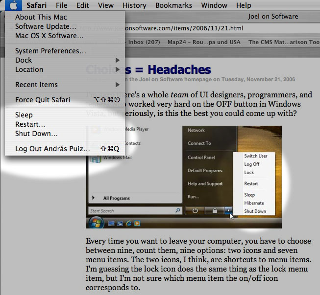
It doesn't happen very often that I strongly disagree with Joel Spolsky, the web's most prominent author on software, but I find his piece on Windows Vista's too many choices for "leaving your computer" flawed in several ways.
When you finish your work and leave your computer, you want to shut it down, put it to sleep, or something like that. Joel counts nine such options in Windows Vista, "two icons and seven menu items." The menu items are Switch User, Log Off, Lock, Restart, Sleep, Hibernate and Shut Down. The two icons are for Lock and possibly Shut Down (he isn't sure about the latter, the icon looks like a power button).
Then Joel goes on to count FN+Key combinations, the actual power button and closing the lid of a laptop, and arrives at a total of 15 choices to make whenever you leave your PC.
He then explains why that's wrong (emphasis added):The more choices you give people, the harder it is for them to choose, and the unhappier they'll feel. See, for example, Barry Schwartz's book, The Paradox of Choice. […] “Schwartz […] shows that a bewildering array of choices floods our exhausted brains, ultimately restricting instead of freeing us. We normally assume in America that more options ('easy fit' or 'relaxed fit'?) will make us happier, but Schwartz shows the opposite is true, arguing that having all these choices actually goes so far as to erode our psychological well-being.”
Of course. Nobody would argue that it's acceptable to force you to make 15 choices each time you want to leave your PC.
The fact that you have to choose between nine different ways of turning off your computer every time just on the start menu, not to mention the choice of hitting the physical on/off button or closing the laptop lid, produces just a little bit of unhappiness every time.
But I have problems with the way Joel counts these choices.Choices vs. redundancies
First, there are seven different choices for the operation to perform, and it's conceptually wrong to confuse these seven options with the different methods available for making your choice.
I can imagine in theory a novice user freaking out, "Should I choose sleep? Hibernate? Shut Down? Switch User? What the hell is Lock? Aaaargh, whatever, I don't care, can I just go away? Why so many choices?!"
Okay, maybe not exactly like that. But my point is that yes, Joel may be right, this can qualify as a problem of the "easy fit or relaxed fit?" variety (for some users at least): being presented with an unexpected or superfluous choice when you would like to just move on without making any further decisions.
But how can you count in here the different methods for making these seven choices? A user can close the lid, push the power button, use a keystroke, or click on an icon in order to activate any of these seven "leave computer" sequences. He'll choose one he prefers, and may not even know about the others. This is a very different kind of choice: it's a redundancy, an important element in user interface design.
Does it ever confuse anyone, or cause any unhappiness that you can select "Copy" from the Edit menu, from a contextual menu, or by pressing CTRL-C (or Command-C on a Mac)? It's not like you want to "Copy" and you have to make up your mind about how you want to do it. Probably, if you're near the menu bar, you'll choose the Edit menu. If you're using your mouse, you'll select the contextual menu. And if you've got your hands on the keyboard, you'll hit the keystroke. Or perhaps you're not even aware of all these options, and you use the one(s) that you like. Arguing against this kind of redundancy isn't something I'd expect from a great usability expert like Joel, and yet this is what he's doing here.The elimination round
I'm not buying into Joe's creative accounting here, so like I said, we're down to seven choices.
Joel goes on to eliminate each of them, arriving at a single "b'bye" button that he thinks should suffice for everyone. It's an interesting idea and a good read, though it only survives on a couple of questionable premises, namely that RAM can be written out to flash memory, and that sleep/hibernation conserves as much energy as a shutdown.
But what's so wrong with these seven choices? True, having to choose between Sleep and Hibernate may be a bit unnecessary and geeky. But don't tell me that anyone's ever had a hard time choosing between Restart and any of the other six commands: when you want to restart, you won't be distracted by the other choices. You've made up your mind before going into that menu, and you won't start wondering whether you should maybe select Sleep or Switch User instead.
Similarly, when you want to switch to another user, you won't be bothered by the availability of a Hibernate option. The problem, if any, is simply that these choices live in one menu with perhaps too many (loosely related) items.
So I think Joel's argument breaks down here a bit as well: if you've already made your choice before going into a menu, why worry about other items that happen to coexist in that menu? By that logic, if you go into the Edit menu in order to select "Cut," does it bother you that you also have "Copy," "Paste," and even "Delete" right there, in the same menu? Should we eliminate them all, and arrive at a generic "Edit" command that somehow substitutes cutting, copying, pasting and deletion? I don't think so.
Joel also adds this comment:Inevitably, you are going to think of a long list of intelligent, defensible reasons why each of these [shutdown] options is absolutely, positively essential. Don't bother. I know. Each additional choice makes complete sense until you find yourself explaining to your uncle that he has to choose between 15 different ways to turn off a laptop.
Not these fifteen ways again! The last time I checked, we were down to seven. Since Restart isn't really a choice for leaving your PC (it just happens to be loosely related and therefore in the same menu), now we're at six.
And here Joel is right: Windows should really let another user log in when the system is locked. I mean, what were they thinking when disallowing that?! If that were implemented, Lock could become a safe option in any multiuser environment for walking away from your screen, protecting your privacy, but without locking out all other users. In this context, Switch User would become less of a way to leave your PC and maybe letting others use it, and more of a choice for an occasion when the other user goes up to you and asks you nicely to let him work in for a sec.
So that would leave us down to five choices. Sleep/Hibernate should definitely be merged (as Joel suggests), and that would leave us at four: Sleep, Shut Down, Lock and Log Off.
I think these four are manageable, and perhaps if there had been just these four options around, Joel would never have written his piece.A (not so) theoretical alternative
What if we organize these menu items a bit better? Let's put Sleep, Restart, Shut Down and Log Off in the same menu (maybe adding the user name to the latter, signifying to Joel's uncle that we're only logging him out). Restart, like I said, arguably belongs there, but isn't easily confused with the rest, so it can stay.
Lock can maybe become a screen saver thing or a general security option: when you activate the screen saver or put the computer to sleep, it will get locked, and you can either unlock it with the current user's password, or a second user can log in. Moving Lock out of the menu may not be the best solution possible, but at least, you're making that menu less cluttered.
And finally, since Lock now lets others log in, switching users no longer belongs among power-off options or among ways to leave your computer after work, so Switch User could really be moved somewhere completely different.
How about this? Still too many choices? Or is this a acceptable now, having found a balance between having all the necessary options without confusing novice users?
In any case, the alternative I've just described happens to be the way Mac OS X handles all of this.Conclusion
Joel's article closes with these comments:This highlights a style of software design shared by Microsoft and the open source movement, in both cases driven by a desire for consensus and for "Making Everybody Happy," but it's based on the misconceived notion that lots of choices make people happy, which we really need to rethink.
True. But the complete lack of choices Joel recommends (while admitting that those choices make perfect sense) would throw the baby out with the bath water. Logging off is not the same as quitting your all applications and switching to another user, especially not manually. Restarting is not the same as shutting down and starting up again, manually. Especially if "Shut Down" were also eliminated – for the sake of a sleep mode where it would be somehow safe to (manually) power off. So I think Joel might have overreacted a bit to Vista's design flaws.
Friday, November 24, 2006
Spaces breaks Exposé
Macworld UK discusses Leopard's Spaces feature.
Expose will be closely integrated with Spaces. This means that you will be able to see all windows in all spaces using Expose, offering a quick and easy way to locate and switch to specific windows among multiple Spaces.This may not be obvious at first, but the way Apple chose to implement Spaces pretty much gets in the way of Exposé. If you have created several Spaces and activate Exposé, it will only minimize windows in the current Space. Windows in other Spaces won't be visible.
If you want to see all your windows in all your Spaces, you need to reveal all your Spaces first (by pressing F8), and then use Exposé, which will work in the minimized Spaces: each window will be scaled to fit the minimized representation of its Space. Currently, before Spaces, all your windows would be minimized to fit the entire screen. That will no longer be the case when you have Spaces. If a Space has too many windows, Exposé will make them miniscule, while windows dwelling in other, less crowded Spaces will be scaled to large enough sizes.
If you have problems picturing it all, this Google video I found should help.
I would certainly prefer a solution where all my windows in all my Spaces would be scaled down and distributed to fit on the full screen. First, it would be a much better use of screen space. Second, for me, Exposé is all about revealing everything (as implied by its name). If I hit F9, I do that because I don't want to worry about switching apps or moving windows out of sight: I want to see everything. And no, I don't want to worry about Spaces either when I hit F9. And third, I don't want to use two consecutive keystrokes instead of one.
I think Spaces basically breaks Exposé in their current implementation. I'm not saying that the current solution is without merit, several users may actually prefer it to the alternative that I miss. But I don't see any reason why Apple couldn't implement that one as well. I certainly think we need a way to let Exposé minimize all windows on one screen, ignoring Spaces.
If you have any information suggesting that such functionality is available or is being planned, please let me know.
Friday, November 10, 2006
Are Widgets worthless?
A caustically funny article by Mac360 states an unpleasant truth: Widgets are useless.
To quote:
Dashboard Widgets are worthless curiosities with high calories and low nutritional value, toy utilities for the weak minded, popular with recent switchers from Windows PCs, who, it seems, are attracted to glitter and bright colors, and Apple delivered.I remember when Widgets were first rumored. I didn't believe them. Everything about them, including their design, seemed diametrically opposite to whatever Apple does. Sometimes I go hunting for widgets that make sense, but usually return empty-handed.
Here's what I use widgets for.
- Weather. I'm an expat, and thus I have a Weather widget up for my native Budapest as well as my current home, Luxembourg. I also put up weather widgets for my holiday destinations, or the current locations of some of my closest friends.
- Calculator. It's nice to have one around at the touch of a button.
- iTunes album art fetch. I don't even remember the name of the widget. I guess fetching iTunes album art is such an unimportant task that I wouldn't go to the trouble of launching a full-blown app for it, but a Dashboard Widget is painless enough.
- Translation. The widget beats the hell out of the clumsy web interfaces we have.
I wonder if Widgets have a potential to mature a bit. I have the feeling that a few killer Widgets are yet to be conceived and built.