It doesn't happen very often that I strongly disagree with Joel Spolsky, the web's most prominent author on software, but I find his piece on Windows Vista's too many choices for "leaving your computer" flawed in several ways.
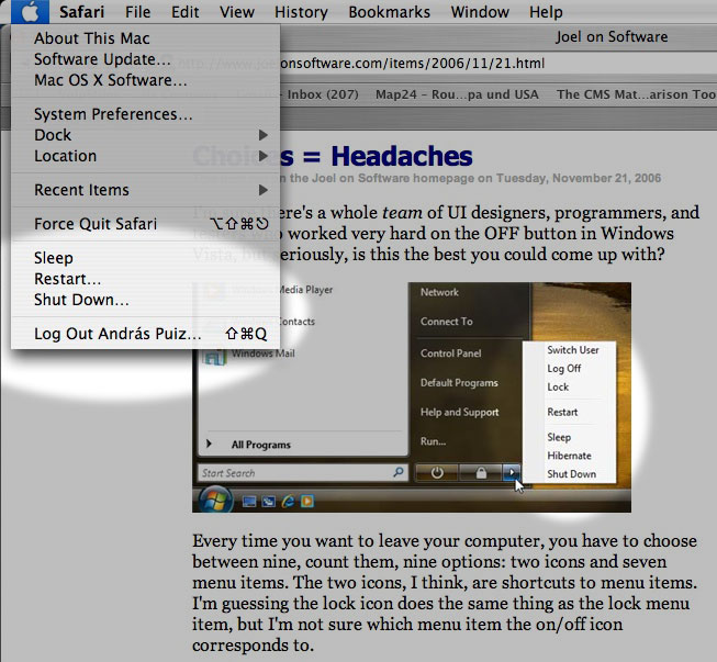
When you finish your work and leave your computer, you want to shut it down, put it to sleep, or something like that. Joel counts nine such options in Windows Vista, "two icons and seven menu items." The menu items are Switch User, Log Off, Lock, Restart, Sleep, Hibernate and Shut Down. The two icons are for Lock and possibly Shut Down (he isn't sure about the latter, the icon looks like a power button).
Then Joel goes on to count FN+Key combinations, the actual power button and closing the lid of a laptop, and arrives at a total of 15 choices to make whenever you leave your PC.
He then explains why that's wrong (emphasis added):The more choices you give people, the harder it is for them to choose, and the unhappier they'll feel. See, for example, Barry Schwartz's book, The Paradox of Choice. […] “Schwartz […] shows that a bewildering array of choices floods our exhausted brains, ultimately restricting instead of freeing us. We normally assume in America that more options ('easy fit' or 'relaxed fit'?) will make us happier, but Schwartz shows the opposite is true, arguing that having all these choices actually goes so far as to erode our psychological well-being.”
Of course. Nobody would argue that it's acceptable to force you to make 15 choices each time you want to leave your PC.
The fact that you have to choose between nine different ways of turning off your computer every time just on the start menu, not to mention the choice of hitting the physical on/off button or closing the laptop lid, produces just a little bit of unhappiness every time.
But I have problems with the way Joel counts these choices.Choices vs. redundancies
First, there are seven different choices for the operation to perform, and it's conceptually wrong to confuse these seven options with the different methods available for making your choice.
I can imagine in theory a novice user freaking out, "Should I choose sleep? Hibernate? Shut Down? Switch User? What the hell is Lock? Aaaargh, whatever, I don't care, can I just go away? Why so many choices?!"
Okay, maybe not exactly like that. But my point is that yes, Joel may be right, this can qualify as a problem of the "easy fit or relaxed fit?" variety (for some users at least): being presented with an unexpected or superfluous choice when you would like to just move on without making any further decisions.
But how can you count in here the different methods for making these seven choices? A user can close the lid, push the power button, use a keystroke, or click on an icon in order to activate any of these seven "leave computer" sequences. He'll choose one he prefers, and may not even know about the others. This is a very different kind of choice: it's a redundancy, an important element in user interface design.
Does it ever confuse anyone, or cause any unhappiness that you can select "Copy" from the Edit menu, from a contextual menu, or by pressing CTRL-C (or Command-C on a Mac)? It's not like you want to "Copy" and you have to make up your mind about how you want to do it. Probably, if you're near the menu bar, you'll choose the Edit menu. If you're using your mouse, you'll select the contextual menu. And if you've got your hands on the keyboard, you'll hit the keystroke. Or perhaps you're not even aware of all these options, and you use the one(s) that you like. Arguing against this kind of redundancy isn't something I'd expect from a great usability expert like Joel, and yet this is what he's doing here.The elimination round
I'm not buying into Joe's creative accounting here, so like I said, we're down to seven choices.
Joel goes on to eliminate each of them, arriving at a single "b'bye" button that he thinks should suffice for everyone. It's an interesting idea and a good read, though it only survives on a couple of questionable premises, namely that RAM can be written out to flash memory, and that sleep/hibernation conserves as much energy as a shutdown.
But what's so wrong with these seven choices? True, having to choose between Sleep and Hibernate may be a bit unnecessary and geeky. But don't tell me that anyone's ever had a hard time choosing between Restart and any of the other six commands: when you want to restart, you won't be distracted by the other choices. You've made up your mind before going into that menu, and you won't start wondering whether you should maybe select Sleep or Switch User instead.
Similarly, when you want to switch to another user, you won't be bothered by the availability of a Hibernate option. The problem, if any, is simply that these choices live in one menu with perhaps too many (loosely related) items.
So I think Joel's argument breaks down here a bit as well: if you've already made your choice before going into a menu, why worry about other items that happen to coexist in that menu? By that logic, if you go into the Edit menu in order to select "Cut," does it bother you that you also have "Copy," "Paste," and even "Delete" right there, in the same menu? Should we eliminate them all, and arrive at a generic "Edit" command that somehow substitutes cutting, copying, pasting and deletion? I don't think so.
Joel also adds this comment:Inevitably, you are going to think of a long list of intelligent, defensible reasons why each of these [shutdown] options is absolutely, positively essential. Don't bother. I know. Each additional choice makes complete sense until you find yourself explaining to your uncle that he has to choose between 15 different ways to turn off a laptop.
Not these fifteen ways again! The last time I checked, we were down to seven. Since Restart isn't really a choice for leaving your PC (it just happens to be loosely related and therefore in the same menu), now we're at six.
And here Joel is right: Windows should really let another user log in when the system is locked. I mean, what were they thinking when disallowing that?! If that were implemented, Lock could become a safe option in any multiuser environment for walking away from your screen, protecting your privacy, but without locking out all other users. In this context, Switch User would become less of a way to leave your PC and maybe letting others use it, and more of a choice for an occasion when the other user goes up to you and asks you nicely to let him work in for a sec.
So that would leave us down to five choices. Sleep/Hibernate should definitely be merged (as Joel suggests), and that would leave us at four: Sleep, Shut Down, Lock and Log Off.
I think these four are manageable, and perhaps if there had been just these four options around, Joel would never have written his piece.A (not so) theoretical alternative
What if we organize these menu items a bit better? Let's put Sleep, Restart, Shut Down and Log Off in the same menu (maybe adding the user name to the latter, signifying to Joel's uncle that we're only logging him out). Restart, like I said, arguably belongs there, but isn't easily confused with the rest, so it can stay.
Lock can maybe become a screen saver thing or a general security option: when you activate the screen saver or put the computer to sleep, it will get locked, and you can either unlock it with the current user's password, or a second user can log in. Moving Lock out of the menu may not be the best solution possible, but at least, you're making that menu less cluttered.
And finally, since Lock now lets others log in, switching users no longer belongs among power-off options or among ways to leave your computer after work, so Switch User could really be moved somewhere completely different.
How about this? Still too many choices? Or is this a acceptable now, having found a balance between having all the necessary options without confusing novice users?
In any case, the alternative I've just described happens to be the way Mac OS X handles all of this.Conclusion
Joel's article closes with these comments:This highlights a style of software design shared by Microsoft and the open source movement, in both cases driven by a desire for consensus and for "Making Everybody Happy," but it's based on the misconceived notion that lots of choices make people happy, which we really need to rethink.
True. But the complete lack of choices Joel recommends (while admitting that those choices make perfect sense) would throw the baby out with the bath water. Logging off is not the same as quitting your all applications and switching to another user, especially not manually. Restarting is not the same as shutting down and starting up again, manually. Especially if "Shut Down" were also eliminated – for the sake of a sleep mode where it would be somehow safe to (manually) power off. So I think Joel might have overreacted a bit to Vista's design flaws.
Monday, November 27, 2006
Joel Spolsky overreacts to Vista shutdown usability issues
Friday, November 24, 2006
Alleged iPhone photo reveals 'rotary dial'
A blogger has posted what is very likely a leaked photo of Apple's upcoming iPhone product. While no hints of smartphone functionality are present, the device apparently pays homage to old rotary-dial phones, using a modified version of the famous iPod click wheel. See the picture right after the jump... Okay, the blogger, who goes by the name BlueBunny, isn't fully convinced of the image's authenticity...
Spaces breaks Exposé
Macworld UK discusses Leopard's Spaces feature.
Expose will be closely integrated with Spaces. This means that you will be able to see all windows in all spaces using Expose, offering a quick and easy way to locate and switch to specific windows among multiple Spaces.This may not be obvious at first, but the way Apple chose to implement Spaces pretty much gets in the way of Exposé. If you have created several Spaces and activate Exposé, it will only minimize windows in the current Space. Windows in other Spaces won't be visible.
If you want to see all your windows in all your Spaces, you need to reveal all your Spaces first (by pressing F8), and then use Exposé, which will work in the minimized Spaces: each window will be scaled to fit the minimized representation of its Space. Currently, before Spaces, all your windows would be minimized to fit the entire screen. That will no longer be the case when you have Spaces. If a Space has too many windows, Exposé will make them miniscule, while windows dwelling in other, less crowded Spaces will be scaled to large enough sizes.
If you have problems picturing it all, this Google video I found should help.
I would certainly prefer a solution where all my windows in all my Spaces would be scaled down and distributed to fit on the full screen. First, it would be a much better use of screen space. Second, for me, Exposé is all about revealing everything (as implied by its name). If I hit F9, I do that because I don't want to worry about switching apps or moving windows out of sight: I want to see everything. And no, I don't want to worry about Spaces either when I hit F9. And third, I don't want to use two consecutive keystrokes instead of one.
I think Spaces basically breaks Exposé in their current implementation. I'm not saying that the current solution is without merit, several users may actually prefer it to the alternative that I miss. But I don't see any reason why Apple couldn't implement that one as well. I certainly think we need a way to let Exposé minimize all windows on one screen, ignoring Spaces.
If you have any information suggesting that such functionality is available or is being planned, please let me know.
Thursday, November 23, 2006
CEO: Palm 'struggled' figuring stuff out. In other news: Pope Catholic
Palm CEO Ed Colligan chimes in on the iPhone "threat" (as quoted by Mercury News):
"We've learned and struggled for a few years here figuring out how to make a decent phone,'' he said. ``PC guys are not going to just figure this out. They're not going to just walk in.''Let's see.
For years, Palm (bought by US Robotics, then by 3Com) was migrating itself, its hardware, software, developers and users away from keyboards. Handwriting recognition (sort of) was the next biggest thing. It worked while the bubble lasted.
Then two founders left over management disputes, and formed Handspring. Handspring added a keypad to a handheld (called Treo) in a moment of clarity, and the smartphone became an instant hit.
So for years, the same inventors were migrating themselves, their hardware, software, developers and users back to keyboards.
Handspring was popular, yet it was dying. Palm was unpopular and dying. So Palm bought Handspring, and finally, all was together in a neat package: the Treo smartphone, the Palm mothership, and the much-tweaked, essential Palm OS software.
It all made too much sense, so something was bound to happen. Palm renamed itself PalmOne, spun off the Palm OS company PalmSource, then renamed itself Palm again.
And licensed Windows Mobile.
I'm starting to wonder if Palm / US Robotics / 3Com / Handspring / PalmOne / PalmSource / Palm is really the best role model Apple can have for straightforward business development.
Additional sources: Palm, CNN, Wikipedia
Tuesday, November 21, 2006
How the iPod could save the PDA without trying (too hard)
Nobody wants a PDA anymore. Worldwide sales of traditional handheld devices (ones without phone capabilities) have been declining for eleven straight quarters, reaching a measly 1.1 million units sold in Q3, 2006 on their way down, according to IDC. Steve Jobs is even proud of not having released a PDA. That's right, nobody wants one.
But then nobody wanted video on an iPod, either. It was an experiment that few, if any, companies could have pulled off the way Apple has. It really struck me as a stroke of genius when Steve Jobs had this to say about the video iPod over a year ago (emphasis added):
"Millions of people are going to buy this to listen to music – and video is going to come along as a bonus. So if anything is going to happen in portable video, it will happen on the iPod. We'll find out what happens."The exact same thing could happen on the PDA front. Today, the iPod has support for games, browsing calendars, notes, photos and videos. In what would be a small step for Apple, but a great step for the ailing PDA market, a new-generation iPod could sprout advanced PDA features any day, and take over the PDA market overnight. That's right: if the long-awaited touch-screen iPod becomes a reality and starts selling in the millions, it will immediately outsell the entire existing PDA market.
It's only a question of choice whether Apple wants to use this opportunity to extend its near-monopoly to handheld devices. Millions of users could buy an iPod – and get a PDA as a bonus. If that won't breathe new life into the personal digital assistant, nothing will.
After all, while traditional PDAs are a dying breed, so-called converged devices (smartphones and phone-PDA combinations) are on the increase. And we all know that Apple is interested in the phone market, don't we? Apple could test the waters with a traditional PDA iPod before plunging into the converged waters.
I think Apple should try its luck here. If the rumors are correct and the next-gen iPod is really going to be all covered by a large touchscreen, its input methods can be vastly extended by virtual (and/or clip-on) keypads, if needed, without compromising the simplicity or the core functionality of the device. You'd touch the screen, and the famous click wheel would appear right at your fingertips – that's what the oldest rumors claim. Okay, now touch the screen in a different way, and a keypad emerges... But only if you want it. If Apple's software people do their job right, the added functions would never get in the way of those who want the iPod to focus on being, first and foremost, an MP3 player. (And so we don't start getting into useless bloatware arguments, either.)
Monday, November 20, 2006
Mac OS Rumors hits rock bottom with more pathological lying
OK, this should be the last mention of that filthy site for a long while, despite our quest to "Periodically check MacOSRumors.com so you don't have to." Remember how the site promised an update for that night just five days ago? Well, that was then, this is now. That update may never have appeared, but why always focus on the negative? Especially in light of today's grandiose update: three mouth-watering rumor headlines concerning the next iPod, an embedded OS X variant, iTV, gaming and iPhone.
Too bad that the articles only contain headlines and no content. However, that is, as always, due to some transient technical issue. This time, it's "catastrophic storm damage." Rest assured, though, that the damage will be repaired, so the "broken links & database bugs in the backup site" will go away by the end of the week.
What an assclown.
Friday, November 17, 2006
Apple files yet another weird hardware patent
According to a patent filing that Appleinsider dug up, Apple is working on (or at least aiming to patent) a multi-purpose touch-sensitive input solution. While patent filings may be deceiving, this pretty much looks like a swappable keyboard/touchpad solution. You could place a QWERTY keyboard on top of it, a piano keyboard, a trackpad, or just about any similar input device that can take advantage of a touch-sensitive surface behind it.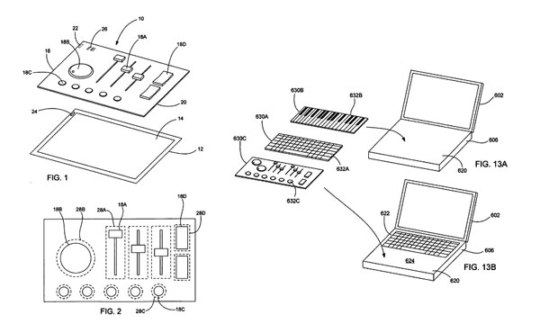 Apple has filed a lot of exciting or crazy hardware patents that went nowhere. There were detachable, wireless screens. Mice with iPod-like scrolling devices. Tablet computers. And really, when was the last time any Mac shipped with a revolutionary ingenious hardware element comparable to such a multi-purpose input device?
Perhaps this has more to do with a handheld device than with a Mac? If and when the touchscreen iPod becomes real, it could allow for an input area large enough to contain a QWERTY keypad, either virtual (i.e. displayed on the screen), or as a strap-on like in this patent filing. And if the iPod gets a QWERTY, it may take on a completely new life with vastly expanded capabilities. Its software is quite advanced even today, and just imagine what could happen to the platform if its greatest limitation, its lack of input options, could be overcome...
Wednesday, November 15, 2006
Welcome to Mac OS Rumors Rumors!
The outage of MacOSRumors.com left the entire Mac community in suspense for several days. We're happy to report that the website is back with a vengeance! Always at the bleeding edge of Mac news and rumors, the site breaks the top story of the week: Apple's no less than five firmware updates, with hard-researhed links to each. True to form, the 800-pound rumor gorilla promises even more relevant rumor updates for "tonight," and posts a personal message (detailing health problems and promising great things for the "prominent" site) by the Steve Jobs of the Mac rumor industry, Ryan Meader himself.
Meanwhile, we have received several, totally reliable reports over the last few days with the gruesome details concerning the cause of the worrisome outage, and once the embargo is lifted off them, we will return with a greatly detailed report. You won't be disappointed! Check back in about five minutes. Better still, keep clicking on our sponsor's advertisement for five minutes, then reload the page.
Also, according to several sources deeply entrenched in the grapevine, the Mac rumor giant has several great features planned for the holiday season. A new (long-rumored) site engine will finally make many of the site's problems a thing of the past. Based on bleeding-edge HTML and even experimental PHP technologies, a massive rewrite of almost the entire MacOSRumors.com system architecture will be finalized by late November, and it will radically reduce the occasions where online content published by the rumor king vaporizes, or worse, turns out to be completely fictional, for an estimated 99.7% of all viewers.
The rumor juggernaut is also in the process of developing new editorial principles that will, according to a handful of MacOSRumors employees who spoke on the condition of anonymity, turn the website into "the next Newsweek," or even "the next Playboy."
Wall Street analysts agree, though the details are vague. One source with an excellent track record in predicting MacOSRumors trends (including the "quite intentional" expiration of the MOSR.com domain name a few years ago) hinted at a "better reconciliation of MacOSRumors.com posts with reality and truthfulness," while another trustworthy source close to the MacOSRumors.com executive team pointed out an allegedly planned "gradual move away from bullshit and lies."
We will keep you posted about these exciting developments. And as always, please take some of these rather unlikely predictions (which many consider little more than wishful thinking) with a grain of salt.
UPDATE: In about nine seconds, I will post the greatest story ever gracing the pages of a Mac blog. Provided, of course, that my middle finger surgery is completed by that time. Luckily, I have all the funds for that. I have the cash right under the... Wait... Oh no! It's gone! My money's gone! Somebody stole it all! Can you help me? I need $15,490, or I won't be able to type! Donations welcome.
Monday, November 13, 2006
Are you bored? Here's some recommended reading
I wasn't bored, and was definitely not trying to kill time. Yet I stumbled upon some articles on a couple of websites that just begged to be read. And I dove in. Hours passed, and I had to forcibly separate myself from all that great reading material, which will certainly provide me with a lot more hours' worth of entertainment and education.
Are you an Apple freak? Do you want to kill some time? Do you like reading long pieces? Do you want some perspective? Then these are for you.
Orchard. As a true Mac enthusiast, I've read all about the mercurial Steve Jobs and the lovable Woz, as well as the evil Bill Gates. Haven't we all? But I've always wondered about the other Apple CEOs. What were they like? I never knew that Amelio had invented the CCD, that Sculley lived in a fantasy world without liars, or that Spindler would sleep under his desk.
And it's not just about the execs. Part of the Low End Mac website, Orchard describes itself as "home to articles on the history of the people and decisions behind the evolution of the personal computer," by history major Tom Hormby. This is a general Apple history section and more, with lots of fascinating content (that is, if you're interested in Apple and tech trivia and timelines and stuff). Hell, it even recounts the story of Sony's original Walkman!
RoughlyDrafted Magazine. Daniel Eran writes about technology, the Mac, Microsoft, and other related topics. And he writes. And writes. And writes. He doesn't write blog posts: he writes articles, well-researched, informative, passionate and thought-out. One every second day or so. All of them are cross-linked and illustrated with sometimes hilarious imagery (with a recurring motif of Steve Ballmer throwing chairs), kind of the way I think Tim Berners-Lee imagined the web would be (maybe except the Ballmer part).
Just start reading any article, and branch out by clicking on the internal links... and be sure to find your way back. It won't be easy after five hours and a hundred followed links. A good starting point would be any of the articles in which Daniel delivers punch after deadly punch to Microsoft's DOA iPod killer Zune. You'll feel sorry for Microsoft, I promise.
Sunday, November 12, 2006
So where's the media center Mac Mini?
It has been rumored with great intensity. Apple would release a new version of its entry-level desktop, the Mac mini, with added media center functionality. One major rumor-writeup even called it a TiVo-killer, purported to know its internal codename (Kaleidoscope) at Apple. Estimated time of arrival: the January Macworld San Francisco expo.
Of 2006.
Well, it never materialized. The rumor mill has become rather quiet about it, especially since the announcement of iTV, a device which looks conspicuously similar to a Mac Mini.
Could it be that the "sources deeply entrenched in the grapevine" were fooled by its appearance, and mistook the iTV for a Mac mini?
It has always seemed very odd to me why, apart from the form factor, rumors would want to turn the Mac mini into a media center:
- The Mac mini is the entry-level Mac. It's designed to be as cheap as possible. It was made for people with basic computing needs. Why increase its costs by adding functionality that most of its users don't want?
- It's uncharacteristic of Apple to introduce functionality exclusive to one Mac model, especially the entry-level Mac.
- Hooking up a Mac to a TV is inconvenient, and Apple knows that. "Would you like an iTV with it, sir?"
So were all the "TiVo killer" rumors just simply totally wrong? Maybe, but perhaps recording capabilities will arrive in a second high-end iTV model later. Just in case they do, let me take this opportunity and warn Apple how crucial it would be to be able to start recording a show immediately. As in, pressing the "record" button. Alas, with the Apple Remote, that would look more like emerging from the depth of a five-level menu, and then delving into another three levels elsewhere before recording can commence. And that would probably mean missing the fun part.
Friday, November 10, 2006
Are Widgets worthless?
A caustically funny article by Mac360 states an unpleasant truth: Widgets are useless.
To quote:
Dashboard Widgets are worthless curiosities with high calories and low nutritional value, toy utilities for the weak minded, popular with recent switchers from Windows PCs, who, it seems, are attracted to glitter and bright colors, and Apple delivered.I remember when Widgets were first rumored. I didn't believe them. Everything about them, including their design, seemed diametrically opposite to whatever Apple does. Sometimes I go hunting for widgets that make sense, but usually return empty-handed.
Here's what I use widgets for.
- Weather. I'm an expat, and thus I have a Weather widget up for my native Budapest as well as my current home, Luxembourg. I also put up weather widgets for my holiday destinations, or the current locations of some of my closest friends.
- Calculator. It's nice to have one around at the touch of a button.
- iTunes album art fetch. I don't even remember the name of the widget. I guess fetching iTunes album art is such an unimportant task that I wouldn't go to the trouble of launching a full-blown app for it, but a Dashboard Widget is painless enough.
- Translation. The widget beats the hell out of the clumsy web interfaces we have.
I wonder if Widgets have a potential to mature a bit. I have the feeling that a few killer Widgets are yet to be conceived and built.